Cursor Composer-2 Has Caught Up Again
Cursor launched Composer-2 this week at a third the price of Composer 1.5. For UI and front-end work, it is hard to argue with the results.
2026-03-21
Loading content...
Cursor launched Composer-2 this week at a third the price of Composer 1.5. For UI and front-end work, it is hard to argue with the results.
Cursor shipped Composer-2 this week at about a third of the old Composer 1.5 price. For UI and front-end work, it is now one of the quickest tools I reach for.
Cursor dropped Composer-2 this week at roughly one-third the old price. The price change is great, but what sold me was using it in normal work and watching how fast it closed the loop.
When the first Composer model landed in Cursor, I was not excited right away. My workflow was simple and steady: queue tasks, work a few streams in parallel, check back when agents finished. That rhythm worked.
Composer broke that rhythm. Waiting stopped being the bottleneck. I was.
I was typing and prompting for hours, shipping whole features in one sitting, because the loop got so short. It took me a while to rebuild how I worked around that pace. Right when that started feeling normal, Composer-2 showed up and raised the bar again.
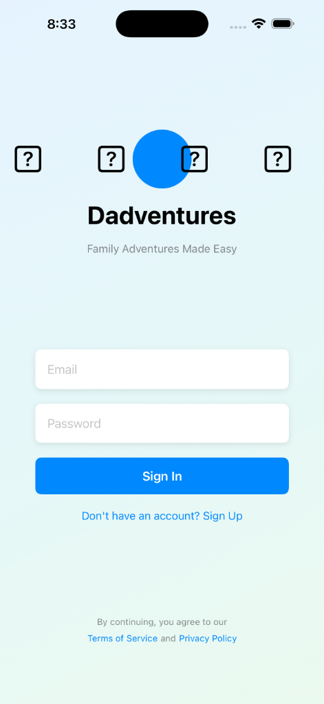
The biggest wins for me are UI and front-end tasks. I tested it on Dadventures, a mobile app I am building.
The launch screen had originally been generated with Claude Sonnet 4.6. It took a few minutes, ended with errors, and still looked rough. Question mark placeholders instead of icons. Flat colors. No clear visual hierarchy.
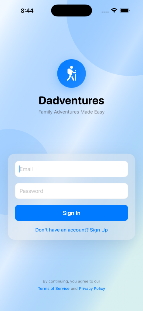
I switched to Composer-2 and gave it this prompt:
This is the screen users see when the app launches. How can we make it look nicer for users? The question marks don't look good, the color scheme seems overly flat, and it's not clear what it's supposed to look like.
Also, we should have some sort of animation going on in the background here.
About twenty seconds later, I had a better screen. The question marks were gone, it used a gradient background, and it added animated orbs behind the content. It also included a real app icon. Total cost was a few cents.
That result was not a fluke. Across several UI tasks, Composer-2 has been faster and more accurate than the models I was using before. The screenshots above show one example, but the pattern has been consistent for me: better output, lower cost, less waiting.
I still use Claude heavily. I am in Claude Code every day, and Claude Cowork is still one of my favorite things in this whole category.
For backend logic, long-running tasks, or deep context on a complicated codebase, Anthropic tools are still my default.
For mobile and front-end work, Cursor now gets the first shot more often. Composer-2 earned that by saving me both time and money in real projects, not in a benchmark.